I know, its not perfect, but it was just to get the conversation started. Maybe we have a graphic artist among us?


I rather like that design!
looks good to me
I am an artist but not a graphic artist. Just a few thoughts.
There are some colour issues happening in both the old logo and Dan's suggestion.
The background colours of green and orange negatively clash with the text colours of blue , purple and red in Dan's sample. These three colours are key colours for the colour concept of blending and merging.
The original colours orange and green work but not the new colours. The blue is not very impactful and is muddy. The green circle just doesn't work in Dan's sample. Experiment more with the circle not jumping out as much as it does. Maybe there is no need for a circle.
The transitioning blue to purple to red are key to focus on with colour for the bisexual meaning. I don't like the transitioning for the colour values that are used in but the colour concept is important. Find better versions of blue and red.
That is just some points.
Last edited by tenni; Mar 4, 2021 at 2:59 PM.

With no offense intended, I have to honestly say that I'm not fond of the colors. I think I 'get it' in that the intent is to suggest a continuum between masculinity and femininity, it just looks better to me in a simpler color scheme.
Nice to know that someone's putting thought into improvements, though...
[QUOTE=tenni;351483] Just a few thoughts.
Thanks...it was to put something out there. I was hoping someone in our user base would run further. I agree with everything you say, but it is not my skill set.
pretty good
I realize I'm not making any friends here by not being particularly supportive of the efforts so far, and I don't mean to offend, but...
I still don't like the colors, and, in this case, don't care for the font, which is too plain and blocky.
I do like the addition of the symbol though!
Warmnsalty
A definite improvement.
Perhaps too much emphasis on trying to get blue-purple-red to fit in? I don't have Photoshop software but consider using the tri colours in the male-female symbols and bisexual.com black against a pale light green background?
or make the .com red
The font may be too blocky but it also might be an idea to use the same font used elsewhere. or Try the font as more fluid but not over swirly(feminine).
Check the use of orange that pops up when moving the cursor to the headlines.
Last edited by tenni; Mar 6, 2021 at 11:36 AM.
The color inclusion is nice - it is a source of pride when using the colors as defined, and allows new comers to see we are a community.
So, I like the concept, and the effort.The exact colors given by the designer are: PMS 226, 258, and 286.[1] Their approximate HTML values are #D60270, #9B4F96, #0038A8;[7] their approximate RGB values are (214,2,112), (155,79,150), and (0,56,168), respectively.
For the font, additional colors for the symbol and '.com', I think a solid logo with consistent font would be an improvement - some fonts are plainer than others, for certain. I did like the first suggestion of the top, while seeing a need to clean up some of that old orange (never knew why that was the color scheme from Drew). Having it in a fun, script like text is a good option, again remaining somewhat consistent.
Maybe not a final, but the thought and effort are good, keep working on the suggested improvements
muuuuch better.....Originally Posted by Warmnsalty

I come from the school where 'none of us is as smart as all of us'...so group thinking and feedback generally gets to a better answer.
so feel free to keep commenting in my opinion.
change the back ground to the bisexual colors and that will give you more range for a eye popping customized bisexual banner.....
same principal as game banners, a blank background does not draw attention as much as a background with symbols in it and you want the banner to grab attention first so people then notice the symbols in the background and other aspects........
a simple and straight forward block letter banner is a statement BISEXUAL but the original banner was more a B to emphasis the B in LGBT and with a underline to emphasis sexual very subtle but most people would only pick it up as a subliminal thing in their minds... and what has the site become? a site all about sex, cock sucking etc etc and very little else.....
now the banner was made about 20 years ago and now its LGBTQIA and people saying that bi is no longer cis gender attraction but attraction to cis and trans gender and others which is more pan but I am not going to get into that argument cos each to their own.......
so maybe a faded or muted pastel color background with smaller flags like the bi one the pride one the poly flag and the different symbols with a eye popping Bisexual banner......
I will see if I have any old programs I can use to whip out a concept art visual idea of what I mean
The only thing more painful than a broken heart, is catching yourself in your zip and having very cold hands
Thank you ...awesome
ok here's a few tweaks based on feedback. No offense to any comments, just playing around here. Without revamping the whole site I thinks it's hard to creative with things as it has to still go with the current layout and color scheme.

Wow, tenni -- you have articulated my thoughts better than I could! I get the 'rainbow' thing, but don't especially like the hues that have been represented so far.
I think the first part of this, especially, is a good idea -- put the color in the symbols. The other suggestions, I'd have to see to fully evaluate.I don't have Photoshop software but consider using the tri colours in the male-female symbols and bisexual.com black against a pale light green background? Or make the .com red
Solid suggestions, all, tenni. You put on your thinking cap before writing this one!The font may be too blocky but it also might be an idea to use the same font used elsewhere. or Try the font as more fluid but not over swirly(feminine).
Damn, thats awesome...thank you for doing that. I could live with any of them. I can live with the current one, but those are nice.
With respect to the 3 examples presented by Warmnsalty, I like the two with a script font more than the first. Of those three, the one in the middle is the most pleasing to me.
I do wonder about the orange, though. Is there anything significant to this color, or is it just a tie-in to the original scheme?
I think that would look better
ok, I just now realized by I dont like the classic blue/purple/pink "thing"...its that its too "clean". The blue first couple letters, ending in pink couple of letters maintains the duality of bi, boy/girl. It is for this reason, I am not a fan of the bi flag.
In this view, it more clearly represents the sliding scale, the multiple genders, the fluidity of being bi.
Because there are a thousand "shades" of bi, it better represents our modality.
It better represents the kinsey scale so many of us use to discuss, but it also speaks for what kinsey doesnt. The white genders are empty, thus allowing us to not fix ANY assignments to anything and over time, the reinvention of what we want.
Last edited by dan.woodlawn; Mar 7, 2021 at 7:25 PM.
Hi All,
Some may dispute my next statement but I picked it up right away and so I did a little researching to make sure. It is not just me.
The font in the "Bisexual" in Dan's post is more feminine and less masculine. Yet the font that Drew used as being more gender neutral.
I'm just say'n. Maybe it won't matter?
This discussion brought to mind an artists picture in a risque magazine - maybe Playboy.
It's not a suggestion just a sharing of a memory.
It was an illustration for an article on openly gay men being allowed into the US Navy.
There was a lot of what could be construed as sea foam in the air with a sailor in his dress whites holding onto a wooden ship's wheel. The two handles he was holding seemed to have some of that sea foam cumming out of the ends of them. There may have been another sailor standing close behind him. I'm not sure.
Nice concept that genders can be more.. neutral. I had not thought about that, I was thinking they looked empty and nondescript next to the nice, colorful script..
Need to put on some more of the D&I training they are giving us awt work to really get my head into this - a simple change has so many aspects that are not so simple!
How about a Rainbow of colors effect?
I like the concept of neutral gender......as some people id as male or female but others as masc or fem........
The background green for the site is actually just a colored template and its not hard to change it......
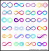
I have changed my id to one of neurogender and neuro diverse which uses the infinity sign as a way of saying the possibilities are endless......because our gender and sexuality is influenced by our minds but the infinity sign in itself can also be used to represent bisexuality as infinite possibles rather than just cock and pussy lol
The only thing more painful than a broken heart, is catching yourself in your zip and having very cold hands
I think something new like Dan created looks good
@Warmsalty created them....i just copied down
Just thought I’d give it a shot and see what other people might think about my own design. It’s really quite difficult to come up with something that most people will really like and accept, but I tried to come up with a creative concept that looks more up to date, with a positive vibe.
I like this view too.
 Posting Permissions

 Reply With Quote
Bookmarks